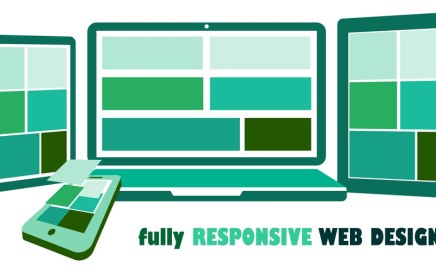
Everyone has had the frustrating experience of viewing a website that isn’t optimized for mobile devices – pages are unintelligible due to unaligned text, links too small to properly access, photos that don’t fit on the screen and content that doesn’t show up properly on the screen. The days when users accessed web content on one standard device, with the same screen size and resolution, are long gone. Where once a website could be built to look great on a desktop, changes in browsing demand developers create sites that can be viewed cleanly across all devices – what’s known as responsive website design.
Initially, in the early days of mobile technology, designers began recreating their websites into “mobile only” versions – effectively building two versions of the same site, one for desktops and one for handheld devices. As the amount of mobile traffic began to grow, developers began to move away from separate sites for different browsers and use responsive design to create sites accessible on basically any device.
With the explosion of popularity of the iPhone, and other handheld browsing devices, the focus on the mobile web experience was put into the spotlight for many developers. As devices and browsers changed, so did the expectations of users. Now pages were needed to fit a phone screen just as easily as they would a desktop, and be just as simple to use.
Designer Ethan Marcotte coined the term responsive design in this 2010 article, where he argued that “rather than tailoring disconnected designs to each of an ever-increasing number of web devices, we can treat them as facets of the same experience.”
Mobile web browsing has tripled in use since 2011 and, today, the majority of digital media is now consumed on portable devices. Users need to be able to access the same website and information on their phone, tablet, laptop or smart device.
Responsive design builds from the concept of multi-device access, from the handheld screens of phones to the large screen size of smart televisions. Every device has different challenges and benefits but websites should be consistently navigable across all platforms.
Responsive web design is more than just fitting on a device’s screen though, it’s also ensuring a site functions in the context and situations unique to the device it’s being viewed on. For instance, a site being viewed on a mobile device should have text fields and buttons that are touch friendly, and be integrated into mobile features, such as geolocation and phone dialing.
Take a look at our New Earth Marketing Blog page. You can drag the size of the browser window to get smaller or larger and watch as the layout, text and images adjust themselves to better fit into the new dimensions of the window.
Understanding the behavior of your user base is essential to having a strong web presence for your business. Visitors to your website should be able to find the information they’re looking for on their desktop or phone in the same amount of time.
For more incentive to create responsive web pages, in 2014 Google updated their search results to give responsive websites higher ranking for mobile users. Sites now are automatically labeled as mobile friendly if they avoid using uncommon mobile software like Adobe Flash, use text that is readable without zooming, resize content based on the browsing device and place links so they can be easily accessed with touch devices.
There’s no better time than now to improve your existing desktop site and create a fantastic, responsive page that is optimized for all screen sizes using the content you already have.
Check to see if your page passes the Google responsive design test. Click the link and enter your URL to have Google analyze if it’s mobile friendly.
Contact us to find out more about making your website respnsive and mobile friendly.

